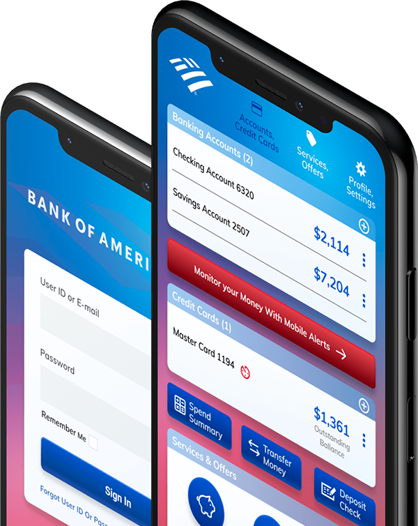
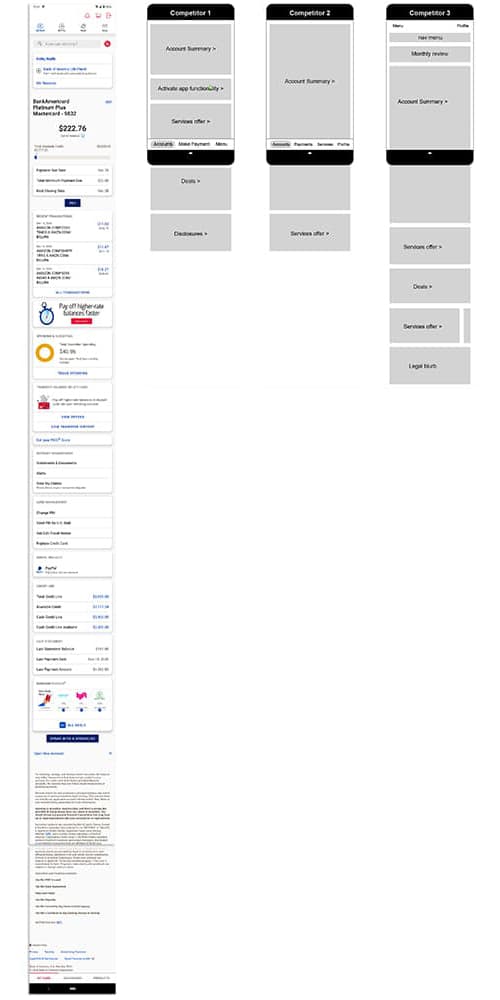
“…This app is very confusing for an average person to use or navigate. Redundancies are prevalent. Too many offers for credit or lending. Neither of which interests me…”
“…Getting there but still too many ads. I am a customer already. Don’t need to be bombarded every moment with more ads. After my last review, I got an updated version. Now even more ads and an additional screen to close when exiting the app…”
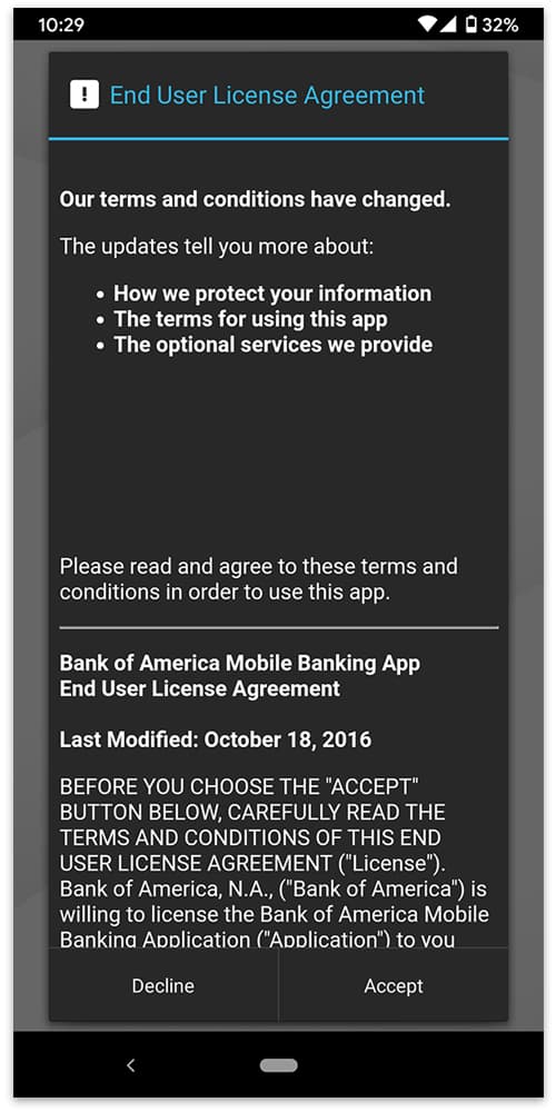
“…Arranging for reward redemption requires too many less than obvious steps. You have to X out of a screen after seeing a message (not use your back key), then shoot the amount up like a pinball game. It’s cute, but commit the steps to memory or you get stuck in a loop looking for the pinball game type tool…”
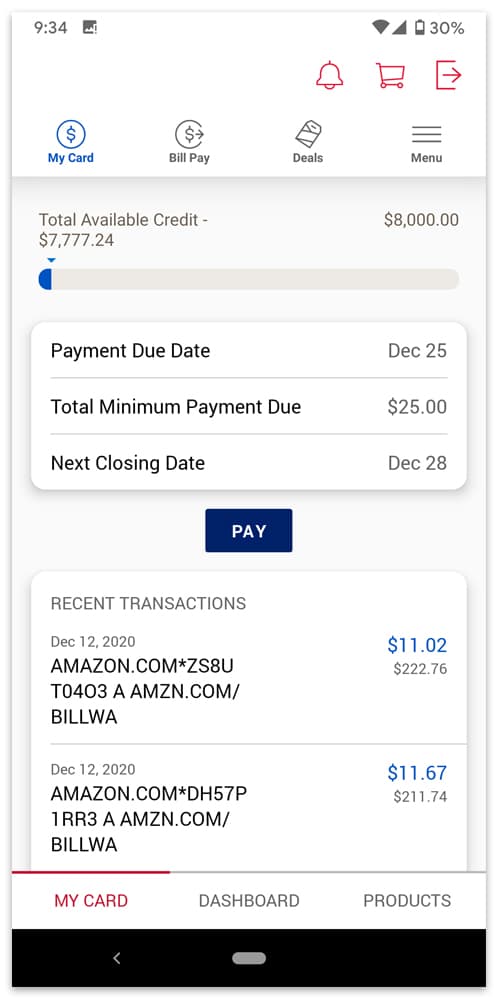
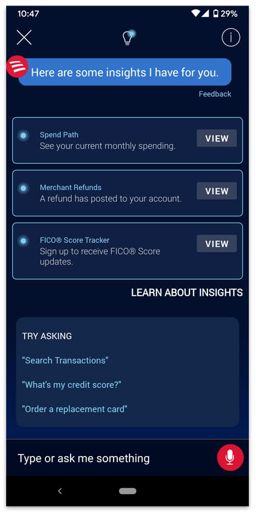
“…The banking aspect is fine, perfectly clear. What is irritating is the amount of clutter on the site. I don’t need Bank of America to remind me of how much I am spending or to offer unsolicited advice. My other bank statement is a glorified spreadsheet, very simple…”


